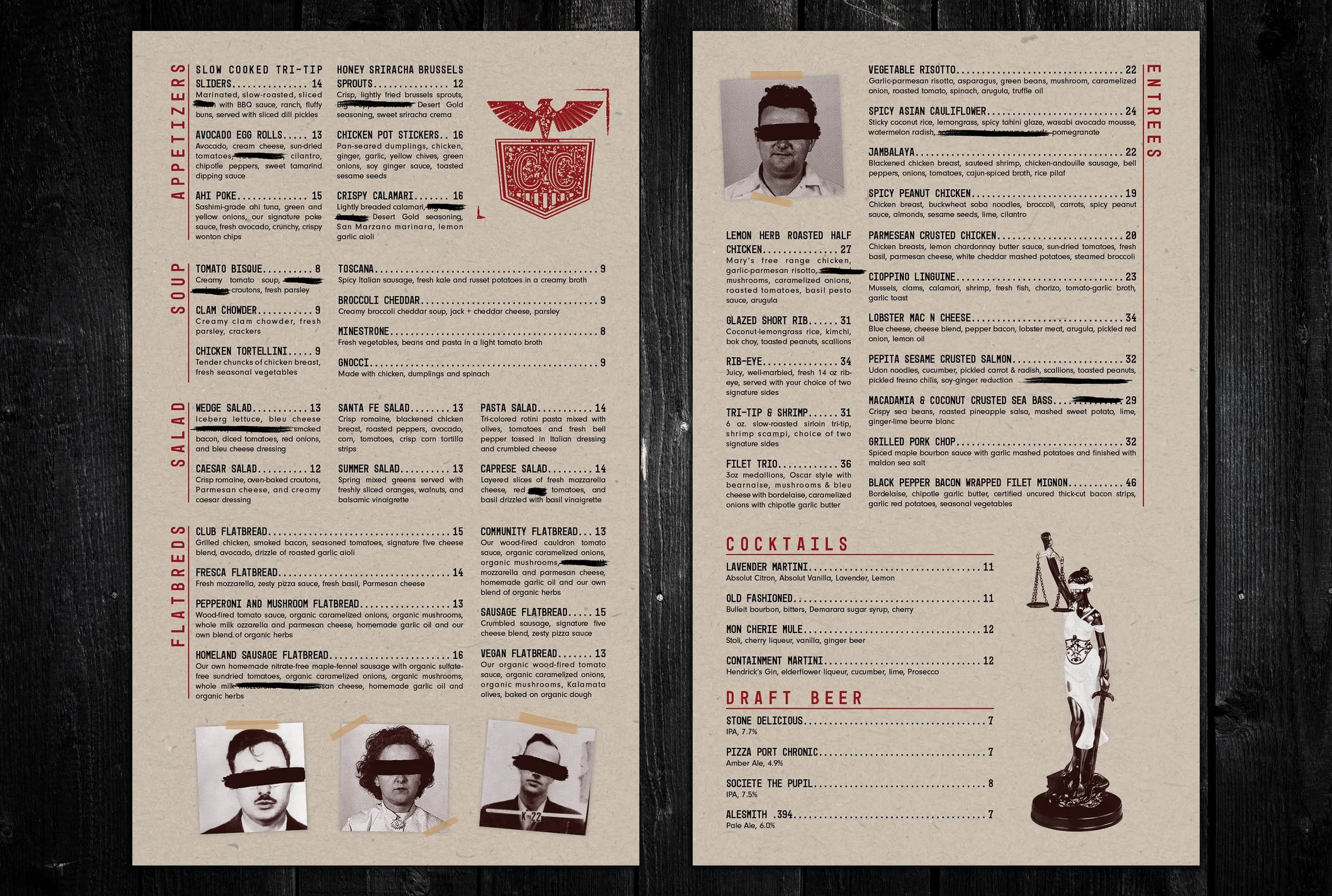
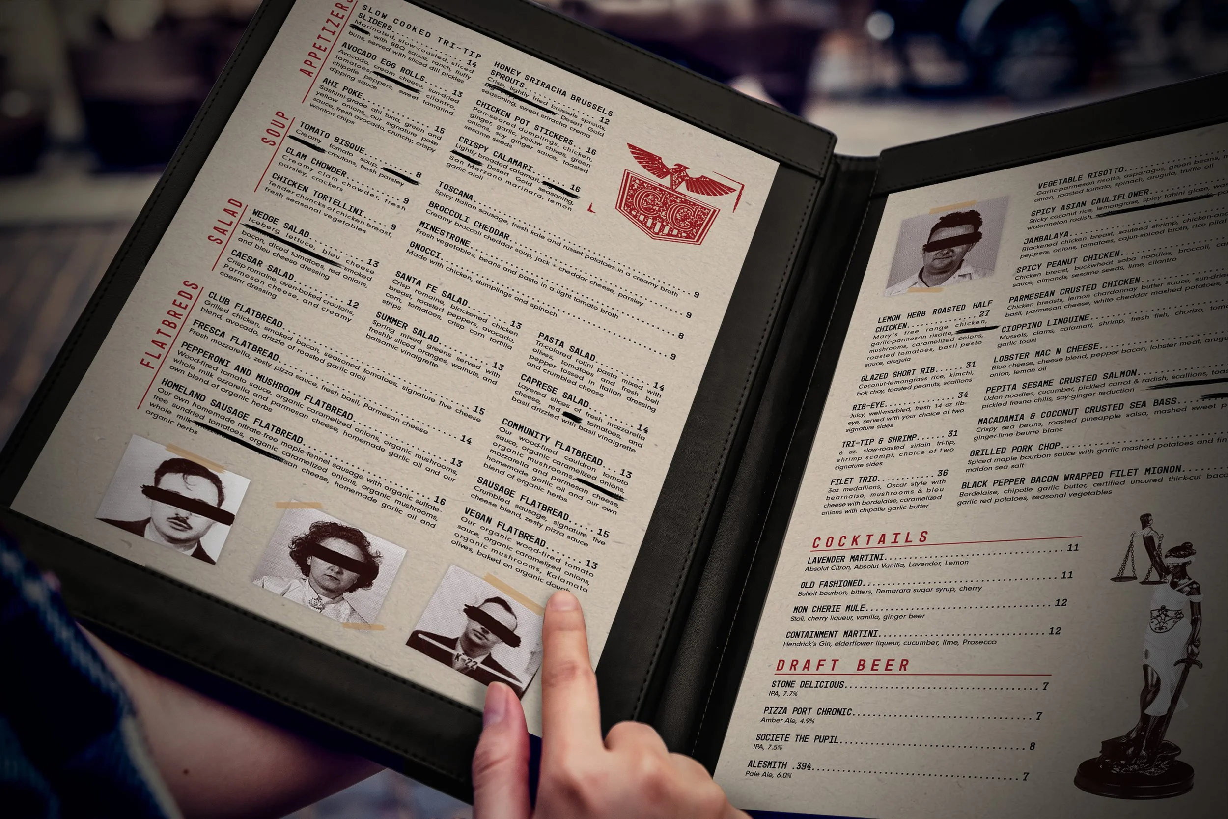
Inspired by the secrecy and allure of the Cold War era, this branding project focused on logo creation and menu design to capture the essence of the speakeasy restaurant's covert ambiance. The logo incorporates elements of mystery and intrigue, while the menu design transports guests to a bygone era through carefully curated typography, imagery, and layout.
Restaurant Branding: Menu and Logo Design
Primary and secondary colors evoke vintage intrigue and provide much of the contrast in the brand.
The logo combined elements that resonate with patriotism and mystique.
A monotype typeface was chosen to mimic documents written with a typewriter while body copy retained legibility with a modern style.
The menu is presented like a classified document, with type redacted and accents of red ink across an otherwise black & white design.
The layout is introduced an in organized manner that appears to have been added onto and patch-worked into its final state.


