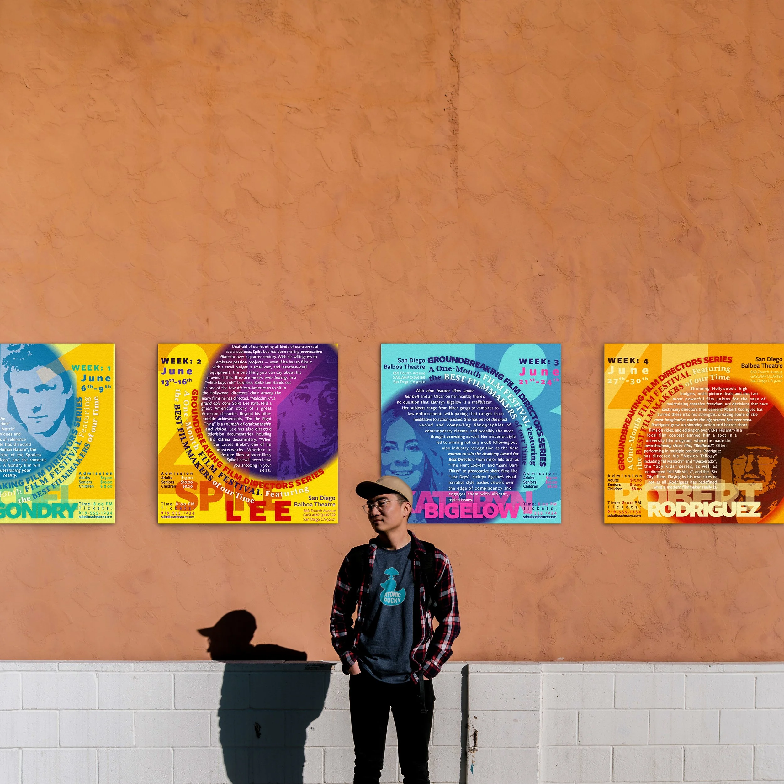
This project showcases a series of four posters designed to promote a film festival. Each poster features a unique design while maintaining a cohesive visual identity across the series. The goal was to generate excitement and anticipation among film enthusiasts, reflecting the diverse range of films being showcased. Through bold visuals, creative typography, and vibrant colors, these posters aim to captivate the audience and convey the energy of the festival.
Balboa Film Festival Poster Series
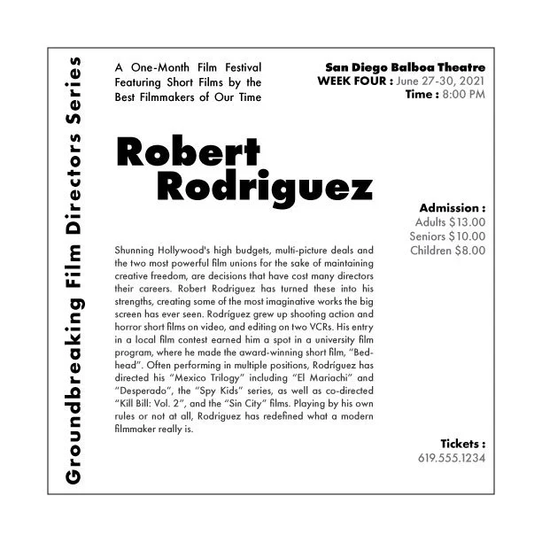
Early iterations emphasized text hierarchy to clearly communicate the copy-heavy design.
Initial Explorations

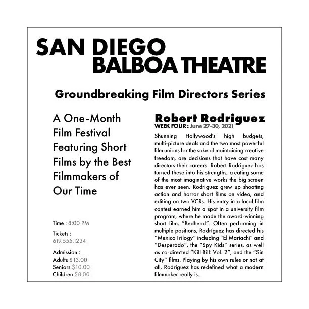
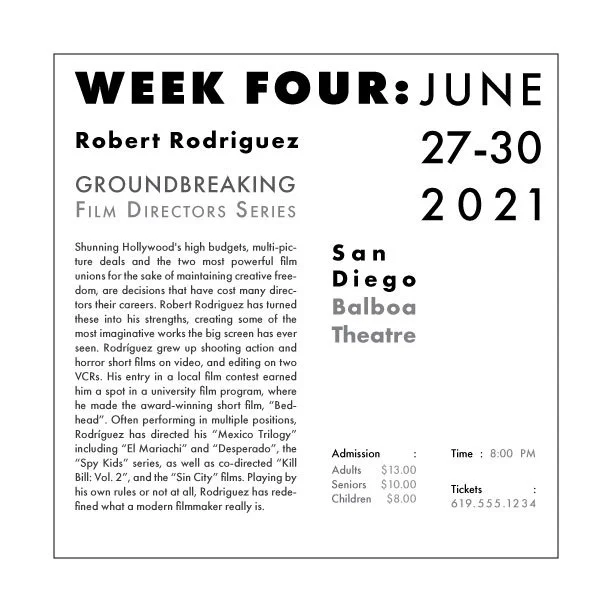

Boundaries began to be pushed, exploring how type axis affects the hierarchy of information.
Continued Explorations

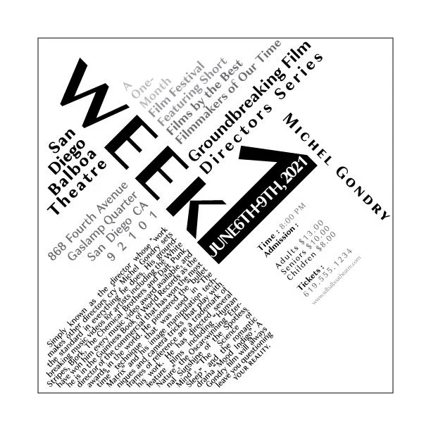
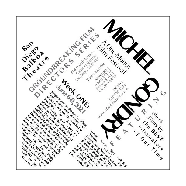
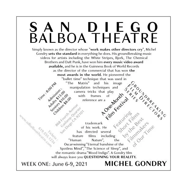
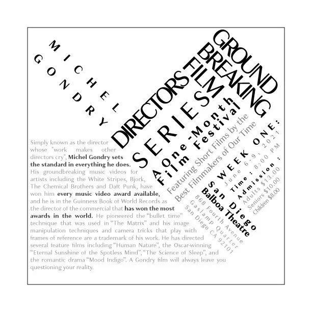
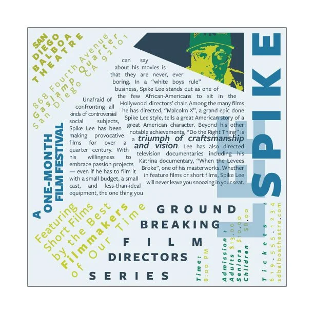
Color and images were introduced as hierarchy and axis were refined further.
Introducing Imagery


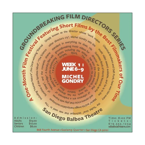
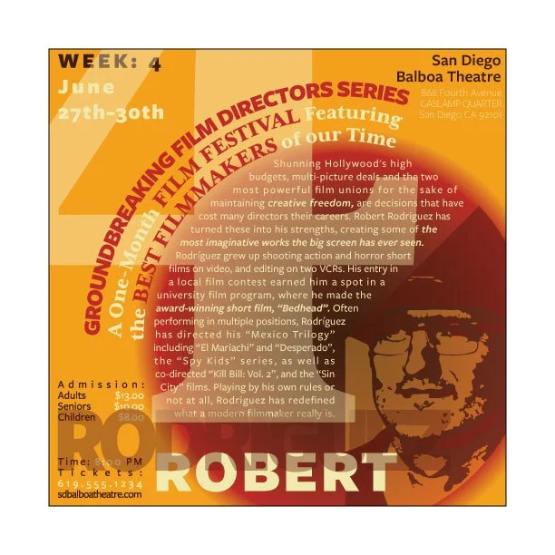
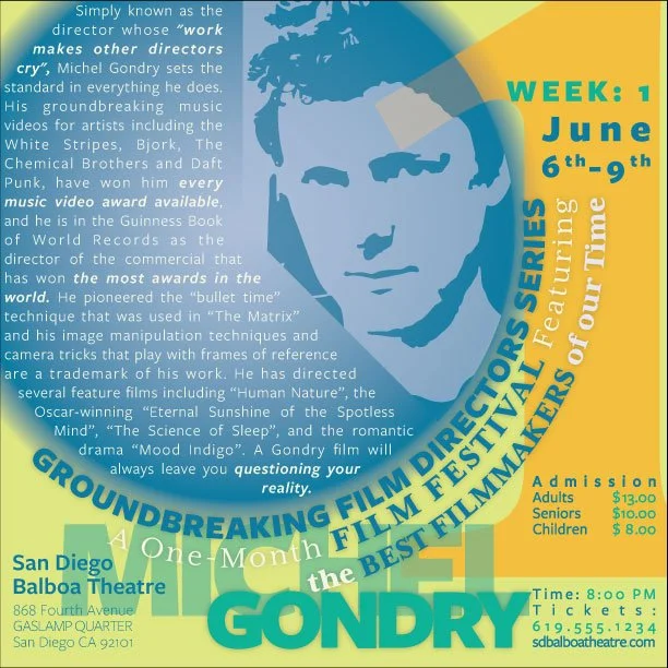
Final Deliverables
Color and contrast work together to create the poster’s visual hierarchy.
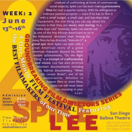
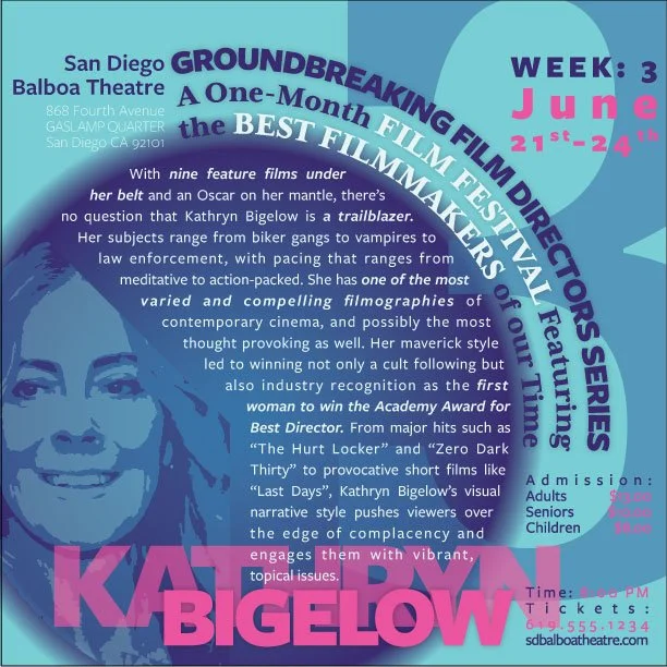
Elements are used in different ways to foster unity through repetition.
Extra care was taken to ensure elements were aligned to frame the design, each pointing to their respective focal points.
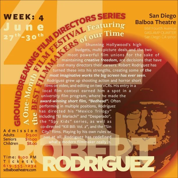
A goal of the design was to push the boundaries as far as could be and design choices to create a sense of edge were introduced.


