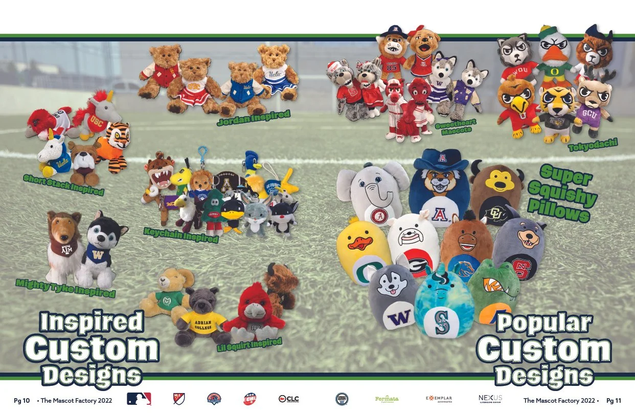
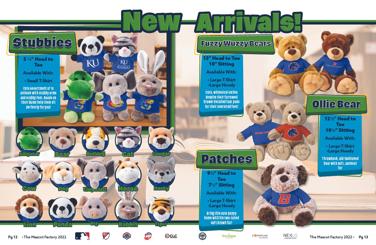
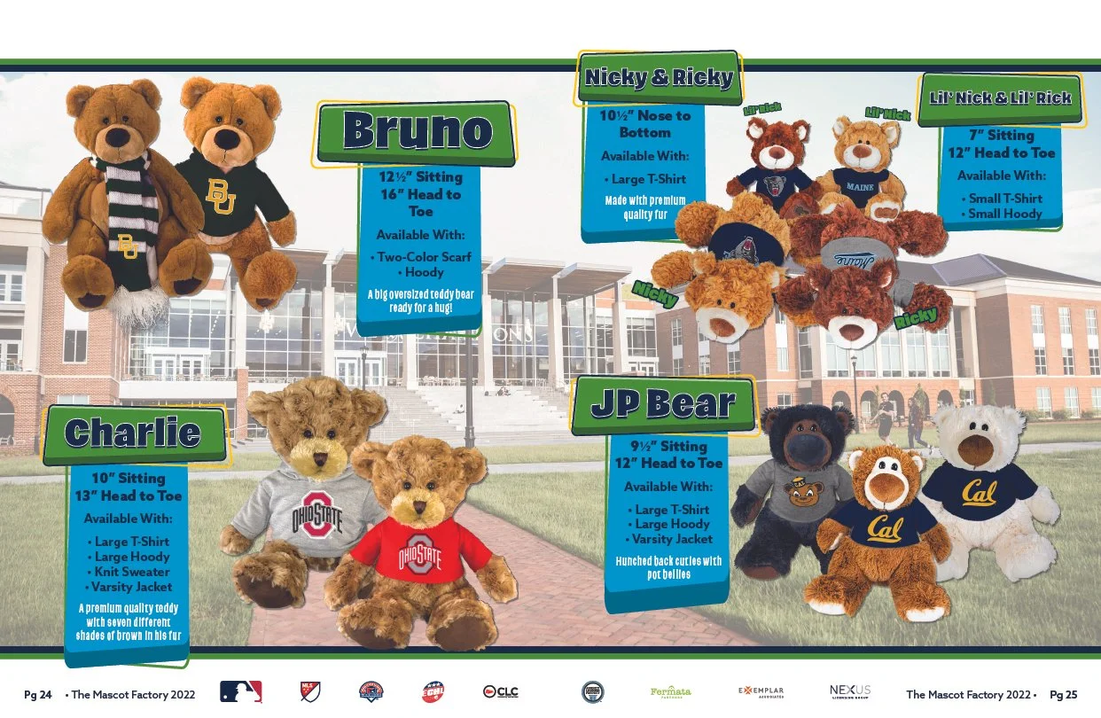
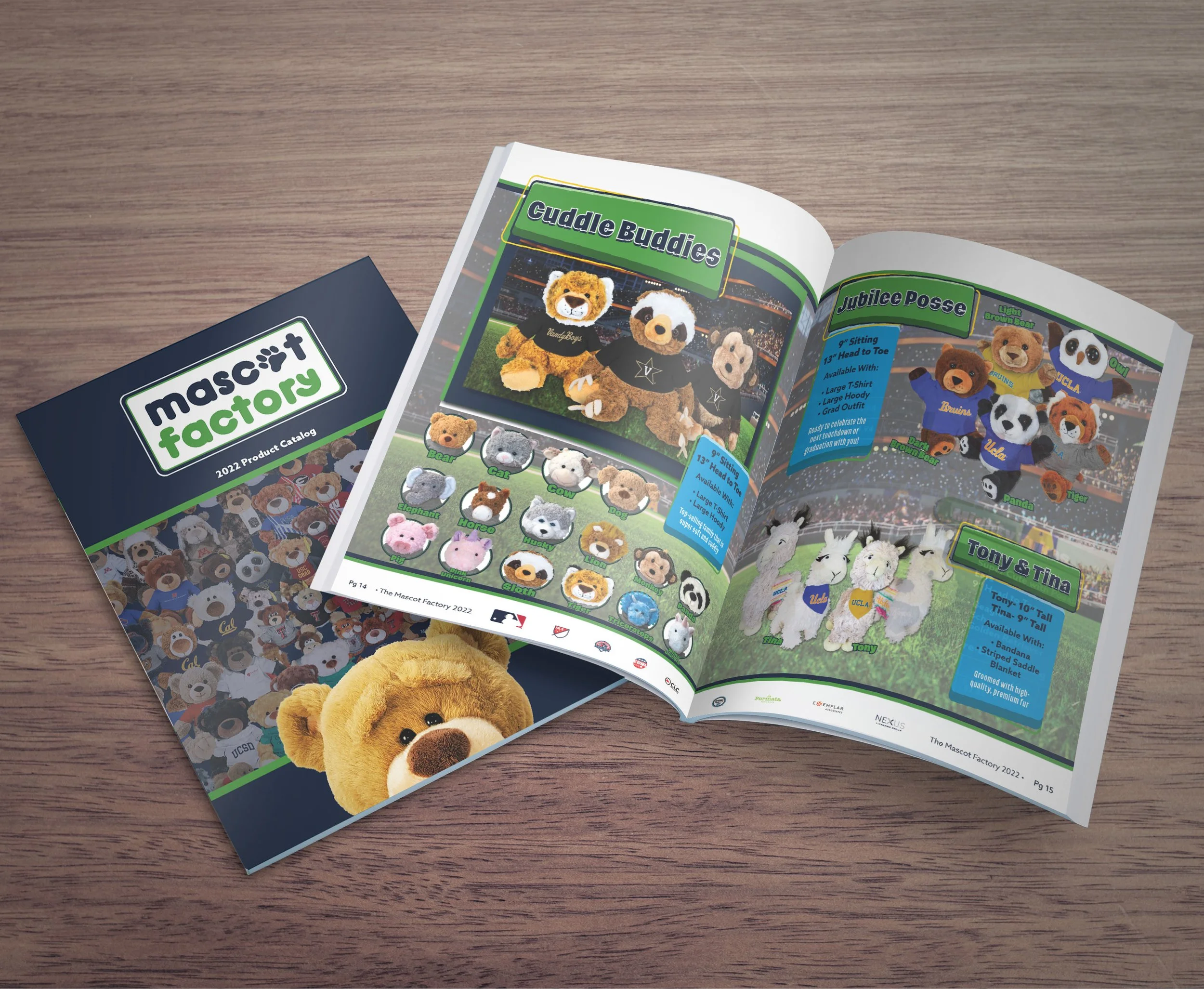
This project tackled organizational challenges while reinforcing the brand's identity. The redesigned catalog strikes a balance between whimsy and sleekness, capturing the essence of The Mascot Factory's brand identity.
Product Catalog
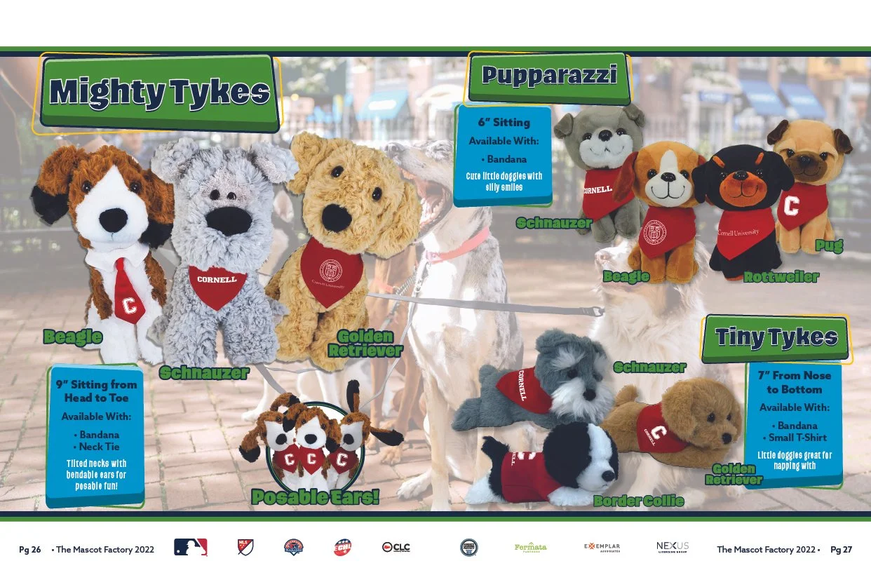
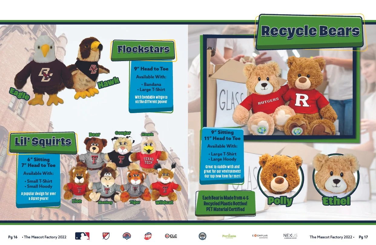
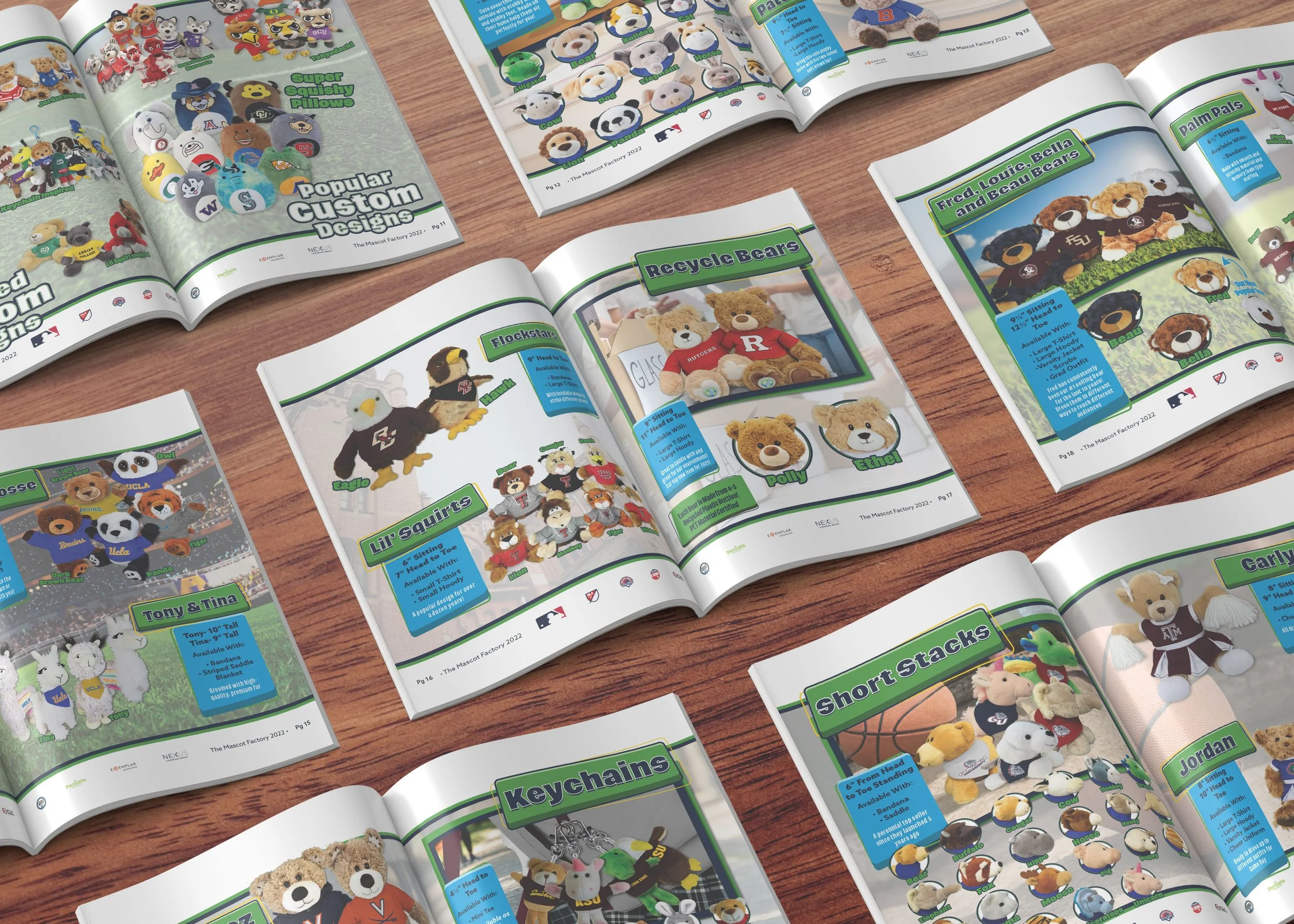
Careful and balanced distribution of product groupings appear on each page. The arrangement of products with similar themes or styles ensures a sense of cohesive organization, creating a visual rhythm for the catalog.
The grid layout guides the flow of information throughout. Incorporation of consistent spacing and alignment creates a sense of rhythm while dynamic image arrangements add movement through use of overlapping images, staggered placements and diagonal alignment.
The harmonious color scheme was used to strike a balance between foreground and background contrast. The color choices not only align with the brand identity but also ensure that the content remains readable and creates a cohesive and visually pleasing experience.
A key for the catalog design is the consistent typography choices and repeated visual elements, establishing a clear and unified visual language. Repetition not only supports readability but also reinforces the brand identity and ensures a cohesive experience across different pages.
Through use of a cohesive color palette, consistent typography and a common design language, a sense of brand identity is created and fostered. The design consistency reinforces the brand’s image and leaves a positive impression.

